Cities— Report
Where the Bus Actually Goes
A month of vehicle position data set against the published timetable reveals a bus network that is reliable on paper and structurally late where it matters most.
Design— Feature
A lettering commission from 1974, drawn for a single harbor, still tells four hundred thousand people a week where to stand.
Gothenburg —
The brief, as recorded in the harbor authority’s minutes for 11 September 1974, runs to two sentences. The signs must be readable from a moving vessel at a hundred meters. They must not be confused with the naval signage on the opposite bank.
From that, a sign painter named Birgitta Sandell drew thirty-eight characters over the following winter. She was paid a flat fee, retained no rights, and as far as the authority’s records show was never consulted again.
Her letters are still on every pier, gate, and gangway in the system. Around four hundred thousand people read them each week without ever considering that somebody drew them.
The distinguishing features of Sandell’s alphabet all trace back to constraints that no longer exist in the same form, which is precisely why it has aged so well. It was drawn to be cut from enamel, so the counters — the enclosed spaces in letters like a and e — are unusually open, because tight counters filled with paint and turned into dark blobs at distance.
The stroke weight is heavier at the baseline than at the cap line by a small margin, a compensation for signs mounted above eye level and read from below. Nobody specified this. Sandell drew it because she had spent fifteen years painting signs that were looked up at.
She was not making a typeface. She was solving a visibility problem, forty times, and the solutions rhymed.
The authority has tried to modernize the signage three times: in 1997, in 2011, and in 2022. Each project commissioned a contemporary wayfinding system. Each was abandoned partway through.
The 2011 survey is the interesting one. Passengers had, over decades, stopped reading the signs as text at all. They had learned the system as a set of shapes. Replacing the letterforms would have invalidated a mental model that four hundred thousand people had built for free.
This is a specific and underrated category of design value: the accumulated familiarity of a public. It does not appear on any balance sheet, it takes decades to build, and it can be destroyed in a single procurement cycle.
The digital displays introduced in 2022 do not use Sandell’s letters. They could not: no digital font of the alphabet existed, and the authority does not own the drawings’ rights in a form that made licensing straightforward.
So the system now speaks in two voices. The permanent signage is Sandell. The screens are a licensed grotesque chosen by the display vendor, which is legible, competent, and completely unrelated.
An unfunded proposal has been sitting with the authority since 2024 to digitize the alphabet properly, reconstructing the sixteen missing characters from photographs of existing signage. The estimate is roughly the cost of replacing nine signs.
Norrback, the archivist, has raised it at three budget meetings. “The difficulty,” she said, “is that nothing is broken. It is only going to be broken later, and later is not a budget line.”
Design Editor
Santiago Vela edits Veyra’s design section and designed the magazine itself, including the cover plate system used across the archive. Vela trained as an industrial designer and worked for eight years on transit wayfinding before moving to editing, which explains a recurring editorial position: if the public has to be taught how to use something, the something is at fault.
Keep reading
A month of vehicle position data set against the published timetable reveals a bus network that is reliable on paper and structurally late where it matters most.
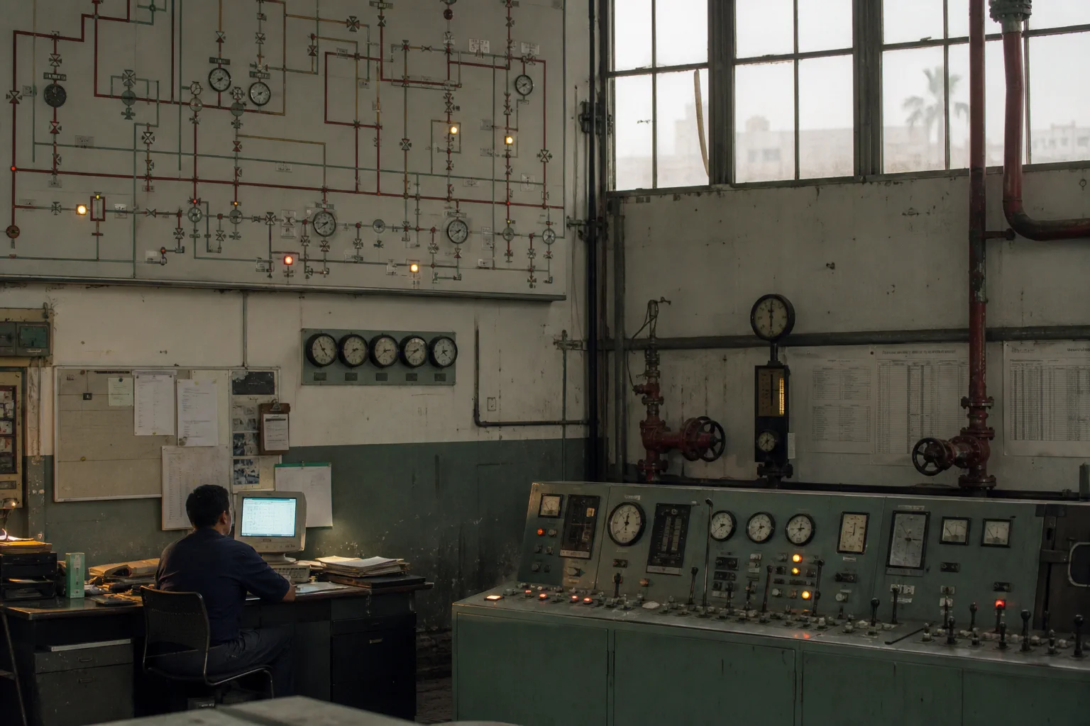
When a mid-sized water utility replaced its paper rota with scheduling software, an unremarkable configuration choice quietly redistributed morning pressure across an entire city.
International time is maintained by a loose federation of laboratories with no enforcement power and shrinking budgets. It works because everyone involved keeps deciding it should.
The Dispatch
Not a digest. One piece from the archive or the week ahead, with a note from the editor on why it was worth the reporting time.