Design— Feature
The Typeface That Runs the Ferry System
A harbor authority commissioned a typeface for its signs in 1974 and never replaced it. Fifty-two years later it is the most-read piece of design almost nobody has heard of.
Design— Dispatch
A district in Mexico City removed the armrests. Two years of observation notes say more about public space than a decade of position papers.
Mexico City —
The benches on Calle Sauces are four and a half meters long, cast in place, and have nothing on them. No armrests, no dividers, no slope, no studs. They were installed in 2023 and they are the most photographed street furniture in the borough, mostly by people who have opinions about them.
What makes them worth a visit is not the design, which is unremarkable, but the fact that the district’s public works office kept notes. Two years of them, twice weekly, by two staff members on a walking route.
The advocacy version of this story is that removing hostile design restored dignity, and the opposing version is that it produced disorder. The notes support neither cleanly.
Daytime use rose substantially and in a specific way: older residents began sitting for longer, and the office recorded a sharp increase in what its notes call “two-person conversations exceeding ten minutes,” which had previously been rare on a bench you cannot comfortably turn on.
We expected an argument about who sleeps here. What we got was grandmothers staying an hour.
Overnight use also rose, as everyone anticipated. The notes record between two and six people sleeping along the four-block stretch on a typical night, up from near zero. The district’s response was not a design change. It was to move a mobile services van to the corner three nights a week, on the reasoning that a bench is a place you can find someone.
Complaints rose in the first six months and then declined below their pre-installation level, a pattern the office attributes less to the benches than to the lighting upgrade that arrived in month eight and which they concede confounds the whole record.
It would be a mistake to read this as a template. Calle Sauces is a wide, tree-lined street in a district with functioning services and a public works office willing to walk it. Remove any of those and the outcome changes.
What does transfer is the method. The district spent roughly the cost of one additional bench on two people walking a route with a clipboard for two years, and as a result can answer questions that most cities can only argue about.
Quiroz put it more bluntly. “Everybody has a theory about benches,” she said. “Almost nobody has a Tuesday in February at eleven at night.”
Design Editor
Santiago Vela edits Veyra’s design section and designed the magazine itself, including the cover plate system used across the archive. Vela trained as an industrial designer and worked for eight years on transit wayfinding before moving to editing, which explains a recurring editorial position: if the public has to be taught how to use something, the something is at fault.
Keep reading
A harbor authority commissioned a typeface for its signs in 1974 and never replaced it. Fifty-two years later it is the most-read piece of design almost nobody has heard of.
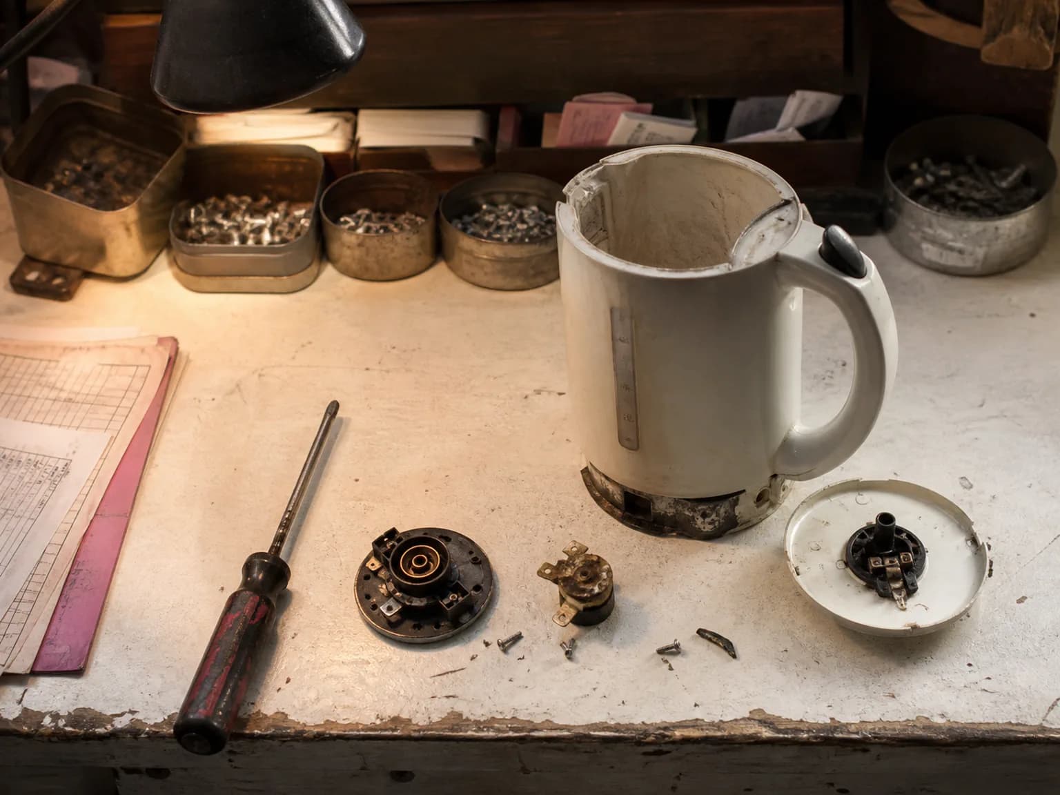
A repair shop’s counter holds a precise record of how things are built now. Twelve objects, photographed as they arrived.
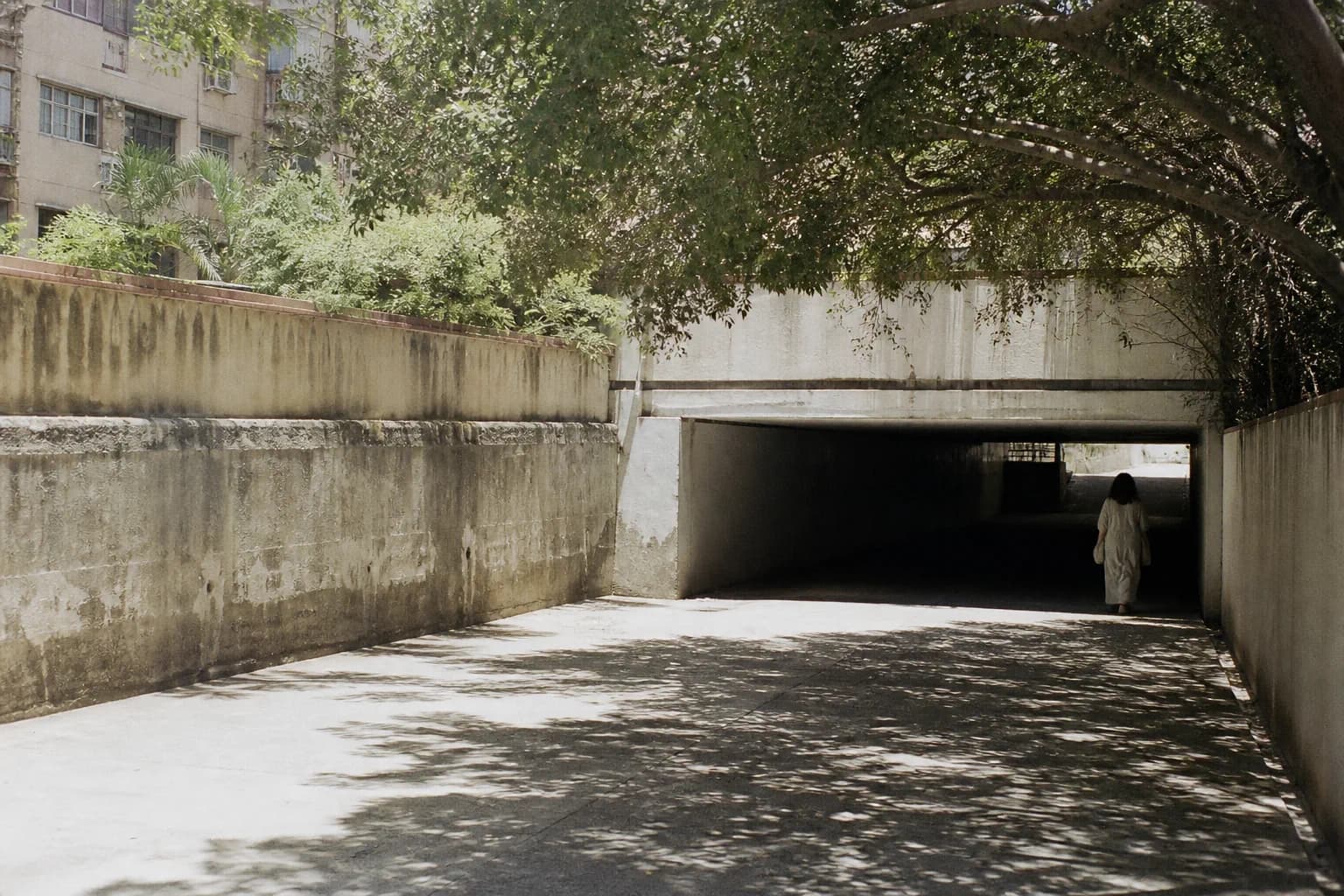
Shade has never appeared on a municipal asset register. A handful of cities are now mapping it street by street, and discovering how unevenly it is distributed.
The Dispatch
Not a digest. One piece from the archive or the week ahead, with a note from the editor on why it was worth the reporting time.